12 Blue Christmas Decor Ideas Inspired by Pinterest’s Cool Blue Trend (2026)
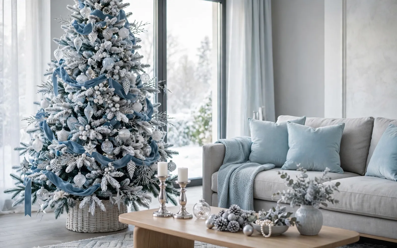
Red and green will always have their place, but this year Pinterest's trend forecasters are pointing somewhere cooler: blue. The platform's "cool blue" palette — icy, glacial tones somewhere between frozen lake and winter dusk — has been named one of the defining looks of the season, and blue Christmas decor ideas are spreading from mantels to whole-room schemes.
The appeal is easy to understand. Blue and white feel calm in a season that can feel chaotic, they photograph beautifully, and they flatter the finishes many homes already have: gray sofas, white kitchens, silver hardware. The trick is layering the right shades — pale ice, dusty blue, a touch of deep navy — with frosted textures and silver light. These twelve ideas walk through the look room by room.
1. An Icy Blue and White Tree Palette
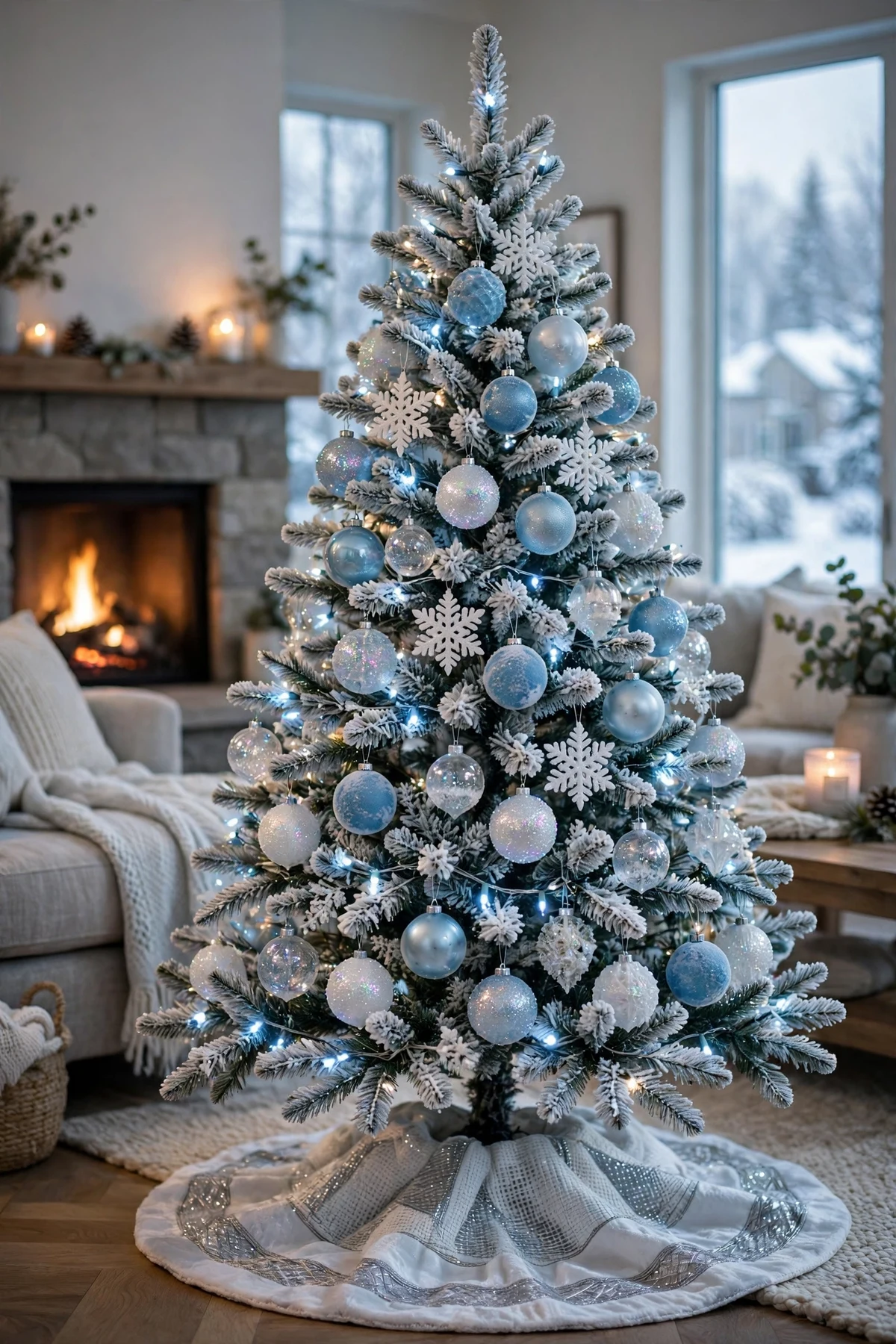
Start where the look matters most: the tree. Build the palette in layers — matte white ornaments as the base, pale icy-blue balls through the middle branches, and a smaller number of deeper blue pieces for depth. Mixing finishes keeps it from looking flat: matte, glossy and glitter versions of the same two colors.
Skip the warm-white lights in favor of cool-white or soft icy-blue strands, which keep the whole tree in the glacial family. A white or silver tree skirt grounds the palette, and if your tree is flocked, you're already halfway there — the snowy branches are this trend's best friend.
2. Blue Velvet Ribbon, Everywhere
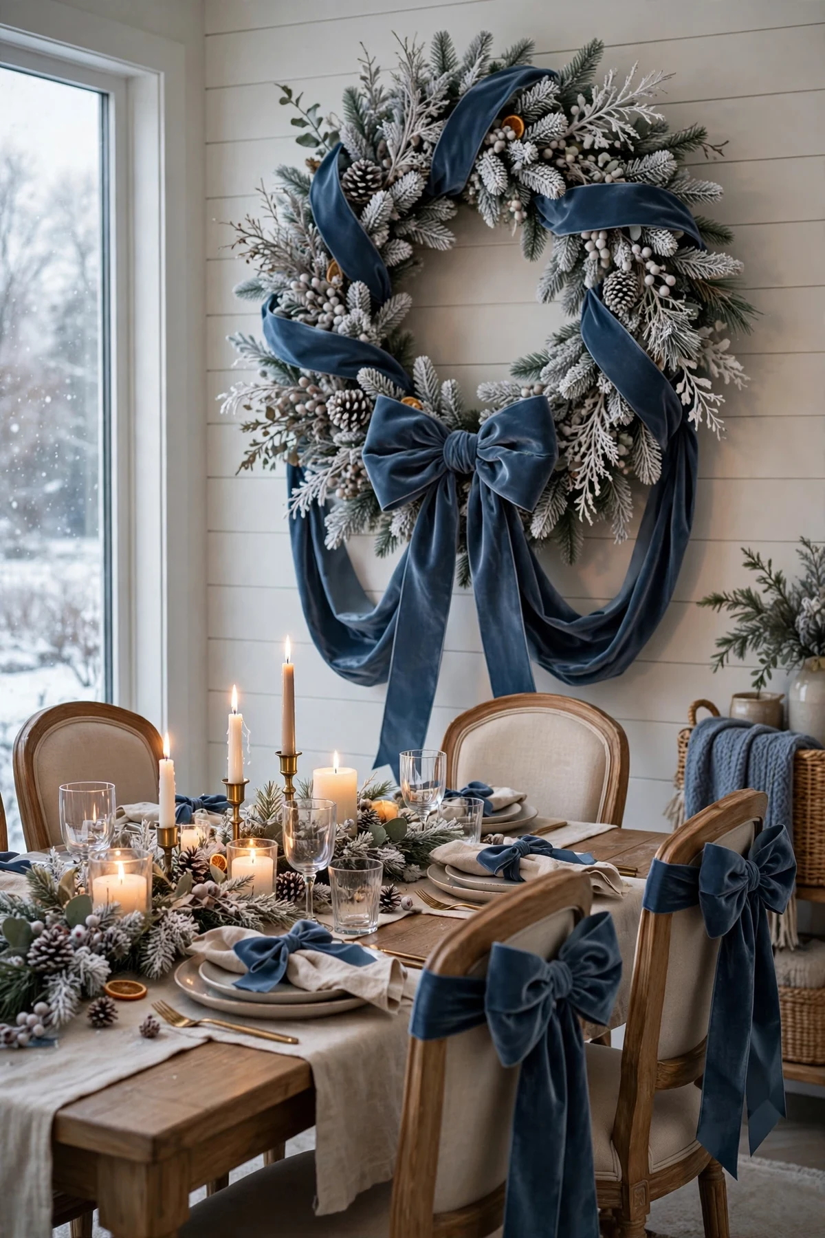
If the trend has a signature material, it's blue velvet ribbon. Tie generous bows on the tree, the wreath, stair spindles and the backs of dining chairs. Velvet absorbs light instead of reflecting it, which makes the blue read richer and calmer than satin in the same shade.
Choose one blue for all your ribbon — dusty blue is the most versatile — so every room connects. Wired ribbon holds a bow's shape best, and wide ribbon (two to three inches) looks more luxurious than narrow. One large spool usually covers the tree, wreath and a few chair backs.
3. Frosted and Mirrored Finishes
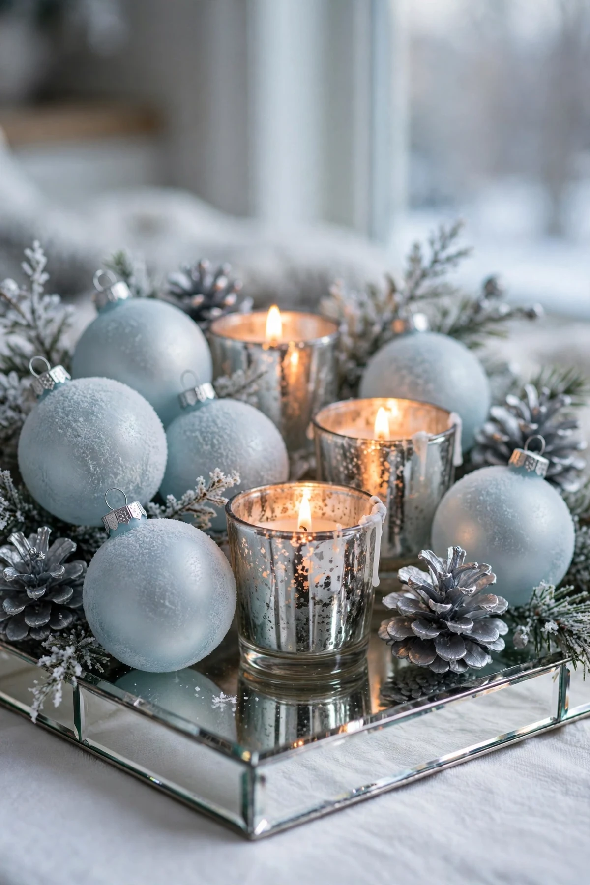
Frost is the texture of this palette. Look for frosted ornaments, snow-dusted garland, mirrored trays and mercury-glass pieces in silver and pale blue. These surfaces bounce light around the room the way ice does — bright, but never warm or brassy.
A practical way to use them: group frosted pieces together on a mirrored tray as a centerpiece or mantel vignette, rather than scattering single pieces. Clustered, they read as one intentional icy moment; scattered, they can read as leftover winter decor.
4. Glass and Pearl Ornaments
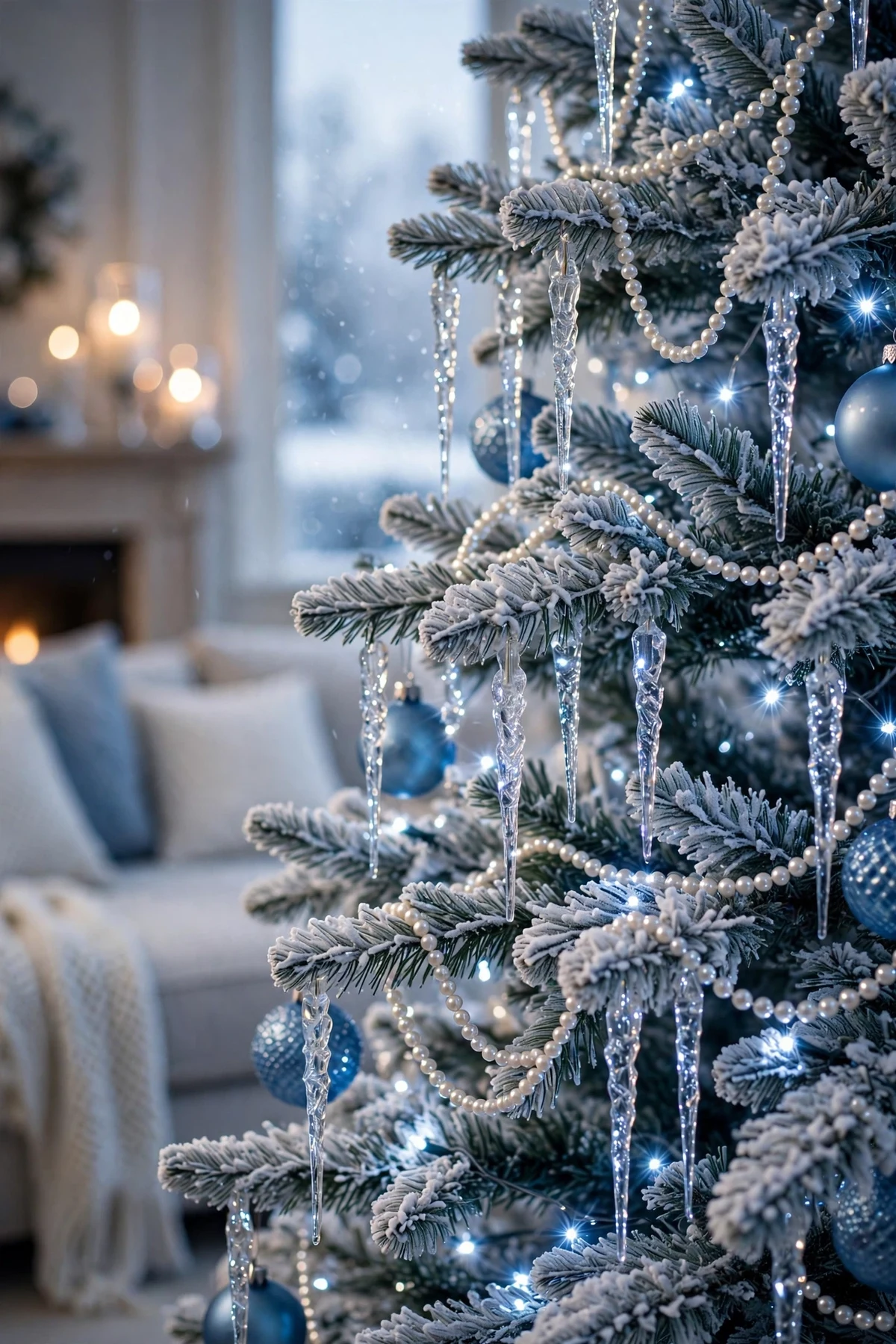
Clear glass, pale blue glass and pearl-finish ornaments give the scheme its jewelry. Glass icicles, beaded garlands and pearl strands layered over the tree's branches catch the cool-white lights and multiply them, making a modest tree look lavish.
Because these pieces are delicate, hang the glass highest and fullest where small hands and pet tails can't reach, and use shatterproof look-alikes on the lowest branches. Pearl strands also drape beautifully along a mantel edge or across a sideboard, softening the blue with a hint of luster.
5. A Celestial Touch
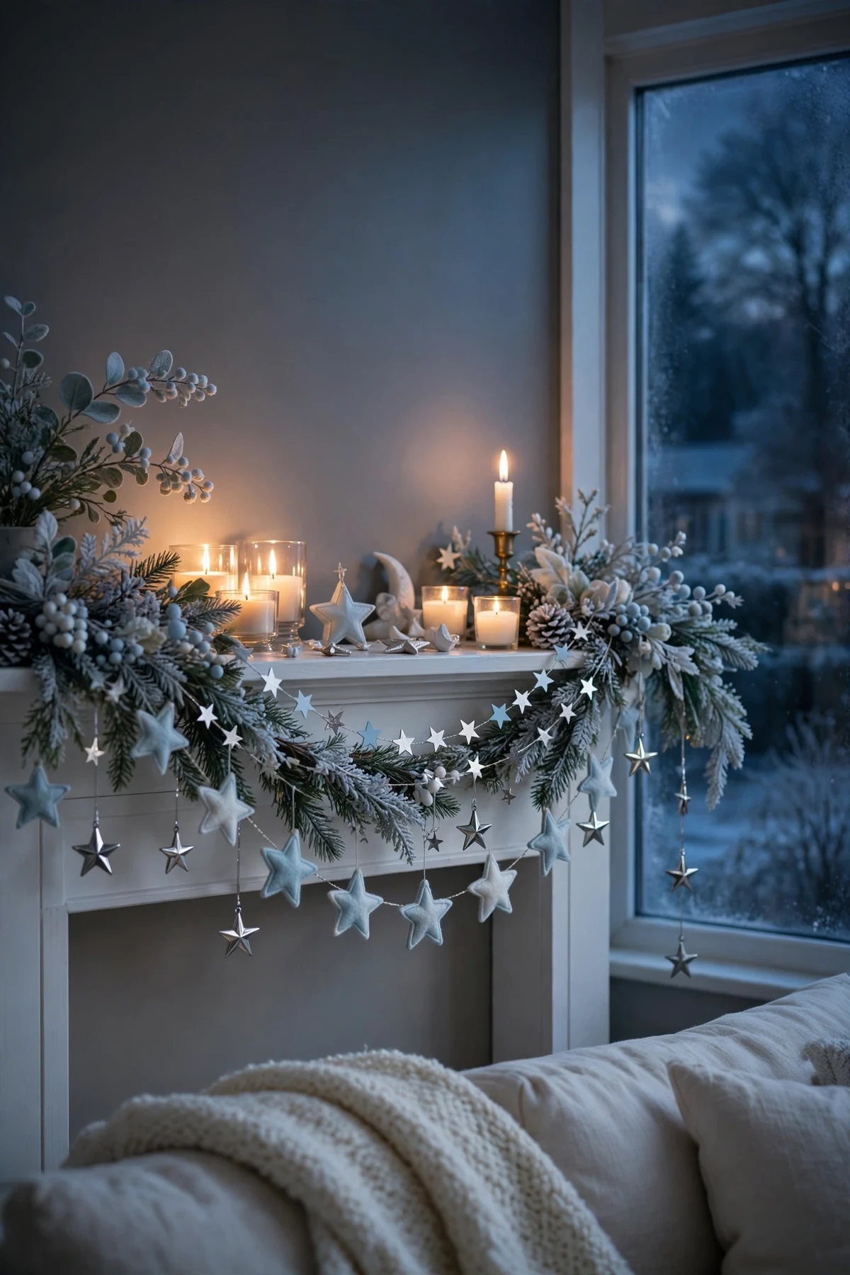
Stars, moons and subtle sparkle lean into the winter-night feeling that makes this palette work. A silver star tree topper, star-shaped ornaments in pale blue and white, and a scattering of star garland across a shelf or headboard give the scheme a theme without tipping into novelty.
Keep the celestial pieces in the same metals and blues as everything else so they feel like part of the palette rather than a separate theme. A crescent-moon ornament or two is plenty — restraint is what keeps this look elegant.
6. Silver Over Gold, Consistently
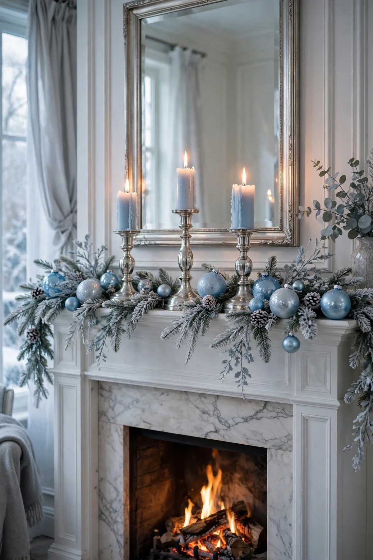
Warm gold fights the glacial mood; silver supports it. Swap gold candlesticks, frames and serving pieces for silver, chrome or pewter versions through December, or simply put the gold pieces away and let silver carry the season.
This one change does more for the palette than any purchase. Silver with blue reads as ice and moonlight, while gold with blue reads as a sports jersey — the difference is entirely in the metal's temperature. If you love mixed metals, keep gold to one small accent far from the main vignettes.
7. A Cool Blue Front Door Welcome
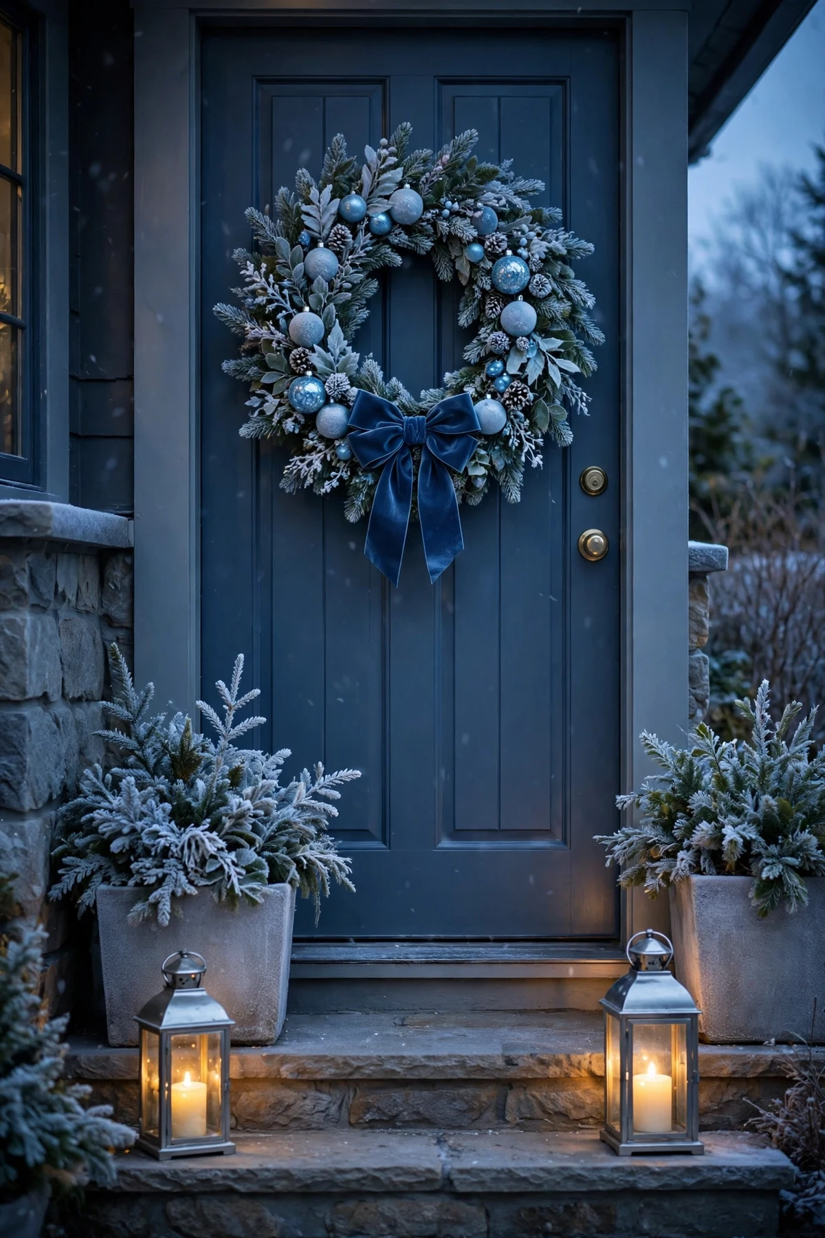
Carry the palette outside with a wreath in frosted greenery, icy-blue ornaments and a blue velvet bow, flanked by lanterns holding cool-white or flameless candles. Against a white, gray or navy door, the look is striking; against a red brick facade, it's a beautiful cool contrast.
Repeat a touch of the blue in a layered doormat or a pair of planters with frosted branches so the doorway feels composed rather than decorated in one spot. Porch visitors get the theme before they ever see the tree.
8. Blue and White Tablescape
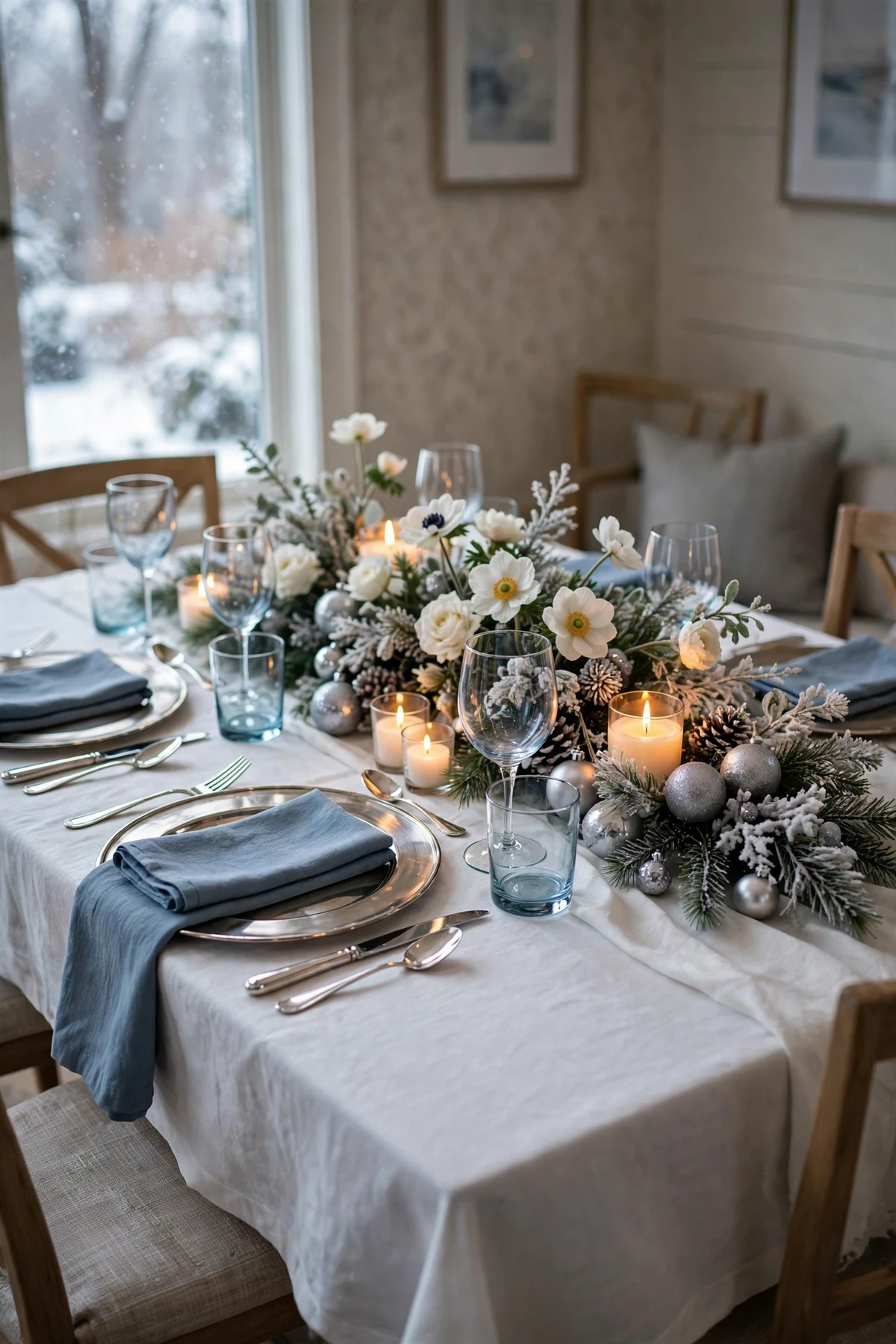
Set the dining table in the same glacial family: white linens, blue napkins or a blue runner, silver flatware and chargers, and glassware with the faintest blue tint if you have it. A low centerpiece of white flowers, frosted greenery and silver ornaments keeps conversation sightlines clear.
Blue is famously appetite-friendly in dining spaces — think of every classic blue-and-white china pattern — so this palette performs as well as it photographs. Add place cards in navy script on white card for the one deep note that anchors the table.
9. A Glacier-Toned Living Room Refresh
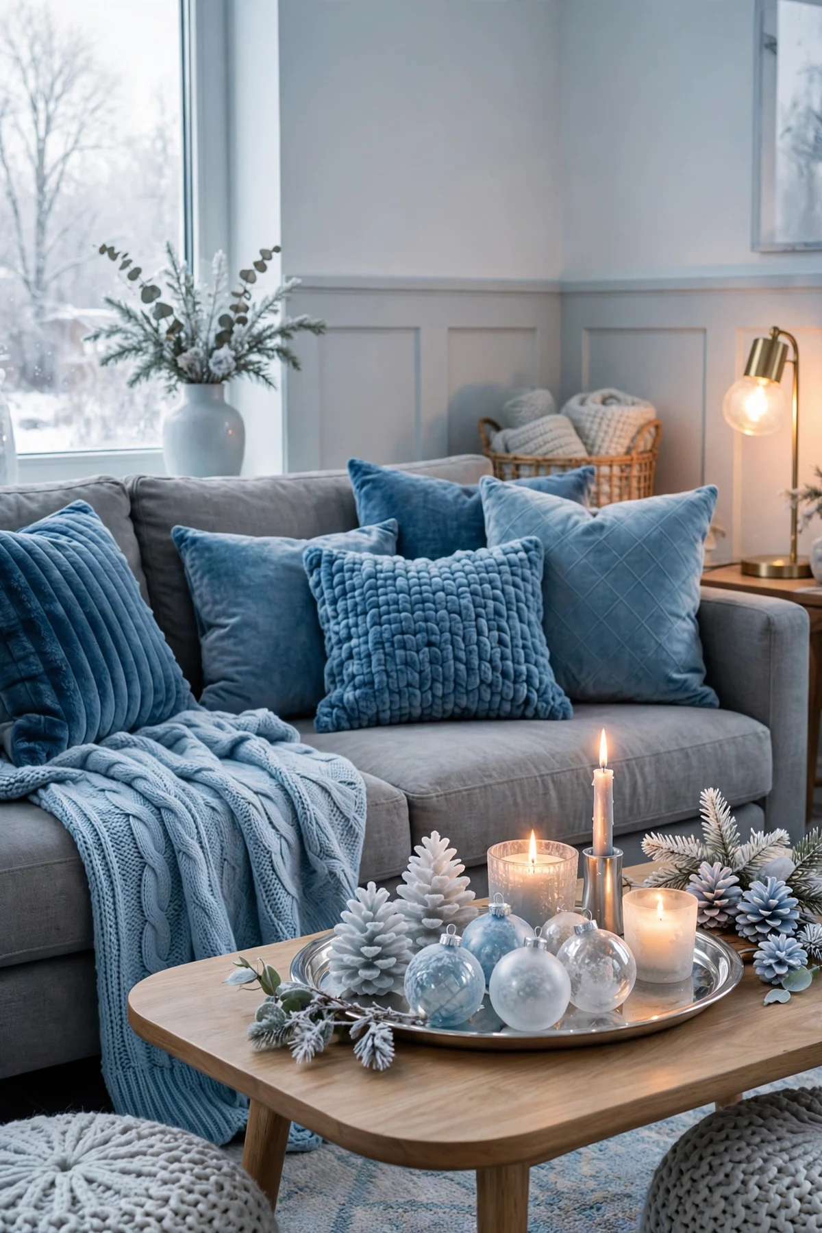
You don't need to redecorate the living room — just swap its soft layer. Blue throw pillows in mixed textures (velvet, knit, a subtle snowflake or plaid pattern), one icy-blue throw blanket, and white or silver accents on the coffee table will tilt the whole room toward the theme.
This works especially well in rooms that are already gray, white or navy; the seasonal pieces amplify what's there. If your sofa is a warm beige, lean on white and the palest ice blue, which sit comfortably with warm neutrals without clashing.
10. A Winter-Night Bedroom
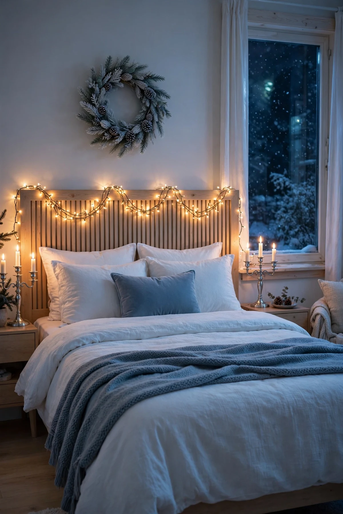
Blue is the most restful color in the bedroom, which makes this palette a natural fit. Layer a white duvet with a dusty-blue throw or quilt at the foot of the bed, add one blue cushion, and put a small frosted wreath or a strand of fairy lights on the headboard wall.
Keep the bedroom version softer and paler than the living room's — this is the wind-down room. A pair of silver or white candle-style lamps or flameless candles on the nightstands finishes the winter-night feeling without any harsh light.
11. Blending Cool Blue into a Warm-Toned Home

If your home runs warm — wood floors, brass, cream walls, brown leather — you can still use this trend without redecorating. The bridge is texture and proportion: use blue in soft, matte forms (velvet, linen, frosted glass) rather than shiny ones, and keep it to about a third of each vignette, with warm whites and natural wood making up the rest.
Silver can meet your existing brass halfway through pewter or antiqued silver finishes, which read cooler than gold but warmer than chrome. Start with one room — the entryway or the tree — and let the palette earn its place before spreading it further.
12. Cool Blue New Year's Carryover
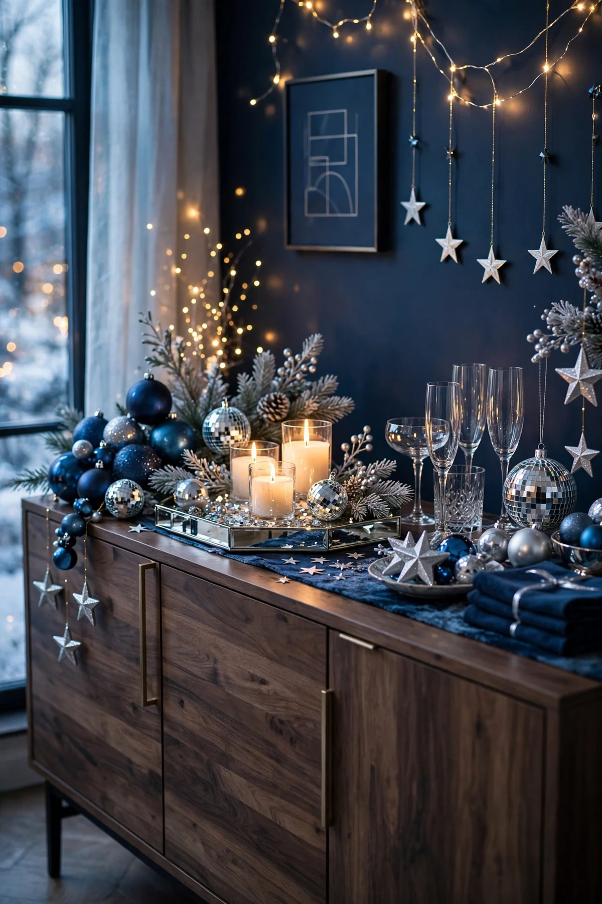
The best financial argument for this palette: it doesn't expire on December 26. Blue, white and silver slide straight into New Year's Eve — swap the tree-specific pieces for clocks, champagne tones in silver, and star or disco-ball accents, and the same ornaments, ribbon and glassware keep working.
Into January, the palest pieces become plain winter decor: frosted garland, white candles and icy-blue throws still suit the season long after the tree comes down. A palette that serves three occasions from one storage bin is a trend worth adopting.
Frequently Asked Questions
What colors pair best with blue Christmas decor?
White, silver and winter neutrals are the core partners. Pale ice blue layers with dusty blue and a little navy for depth, while flocked greenery and pearl finishes add texture without adding new colors.
Can I mix blue Christmas decor with my existing red or gold pieces?
A full mix dilutes both looks. If you want to transition gradually, decorate one room in blue and keep another in your traditional palette, or use blue on the tree and keep red to the kitchen. One small gold accent is fine; a half-and-half scheme usually reads indecisive.
How do I keep blue decor from feeling cold?
Texture is the fix: velvet ribbon, knit throws, flocked branches and lots of candlelight or fairy lights. Frosted and matte finishes feel softer than shiny ones, and grouping pieces in layered vignettes makes the palette feel cozy rather than stark.
Where should I start if I only buy a few blue pieces?
Ribbon, one box of mixed-finish blue ornaments and blue pillow covers. Those three inexpensive items touch the tree, the wreath and the sofa — enough to establish the palette in the rooms that matter most.
Conclusion
Cool blue works because it decorates the way winter actually looks: frosted, silvered and calm. Build it from a layered tree palette, repeat one blue velvet ribbon through the house, and let silver and glass do the sparkling. Whether you go all-in or just test one room, the glacial palette brings a quieter kind of magic to the season.