21 Small Kitchen Ideas to Make Your Space Feel Bigger
Introduction
Walking into a cramped, dark cooking space every morning can instantly feel overwhelming, but you do not need a massive budget or a full teardown to fix it. Discovering practical small kitchen ideas can completely transform how your layout feels and functions every single day. Whether you are dealing with cluttered countertops, limited storage drawers, or dim corners that make cooking feel chaotic, simple design adjustments can unlock surprising potential in your home. In my experience, even minor visual tweaks—like changing lighting or freeing up vertical wall space—can instantly open up a room and make it feel remarkably airy. I’ve seen many people benefit from rethinking their existing footprint rather than living with frustration. This guide breaks down visual, easy-to-implement upgrades designed to maximize every square inch, bring in beautiful light, and create a warm, inviting space you will truly love spending time in.
Glass-Front Cabinet Doors

- Replaces heavy wood surfaces with reflective glass to open sightlines.
- Creates an airy feeling by drawing the eye inside the cabinetry.
- Encourages clutter-free storage while displaying curated dishware beautifully.
- Works exceptionally well when paired with subtle interior cabinet lighting.
Replacing solid upper doors with glass panels immediately shifts how you perceive depth in a compact culinary zone. In my experience, solid wood fronts often act like solid walls that stop the eye, making a cramped room feel claustrophobic and boxed in. When you introduce transparent surfaces, the visual boundary recedes all the way to the back wall of the cabinet frame. This creates an illusion of extra square footage without altering the actual footprint. Sunlight bounces naturally off the clean glass panels, casting a soft, luminous glow across your counter prep areas throughout the day.
To maximize this open feel, organize the contents thoughtfully rather than packing every shelf full. Displaying uniform white dishes, clear glassware, or simple ceramic bowls keeps the visual energy calm, organized, and inviting. I’ve noticed that adding wireless puck lights inside the upper cabinet frames elevates the entire look after sunset, turning functional storage into an elegant focal point. This simple trick adds warm accent lighting while enhancing dimensional depth. When your eyes move across smooth, reflective glass rather than heavy, opaque materials, the room instantly feels significantly brighter, airier, and more spacious overall.
Vertical Wall Shelving
- Maximizes vertical wall space without consuming valuable counter real estate.
- Keeps daily cooking essentials easily reachable yet visually organized.
- Adds warm wood textures that break up cold, monochromatic walls.
- Prevents upper wall space from feeling bulky or overly enclosed.
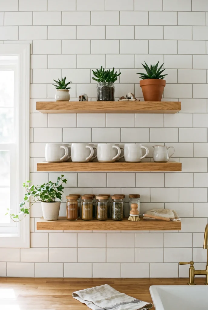
When floor space is tight, taking advantage of your vertical wall real estate is the smartest layout strategy available. Installing sleek, floating shelves upward toward the ceiling draws the eye overhead, creating the distinct impression of taller walls and higher ceilings. I’ve seen this work incredibly well in tight galleys where traditional upper cabinets make the workspace feel dark and crowded. By leaving the sides open, air and natural light move freely across the room, preventing that heavy, enclosed box feeling. You gain essential storage space without sacrificing a single inch of your floor layout.
Styling these vertical surfaces requires a careful balance between daily functionality and clean aesthetic appeal. Arrange your most frequently used coffee mugs, favorite cookbooks, or clear glass jars filled with dry goods on the lower, easily accessible levels. Keep the topmost shelf lightweight with a small trailing plant or minimal decorative ceramics. That’s why many designers recommend keeping open shelving uncluttered; overcrowding them instantly brings back a chaotic, messy feel. When executed thoughtfully, this open-concept storage method transforms empty wall surfaces into a functional, beautifully balanced focal point that opens up your whole kitchen area.
Under-Cabinet LED Lighting
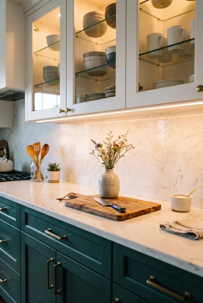
- Eliminates harsh dark shadows under upper cabinets for a roomier feel.
- Highlights beautiful countertop textures and backsplashes effortlessly.
- Provides energy-efficient, targeted task lighting for everyday meal prep.
- Creates depth and warmth that makes small kitchen ideas feel grand.
Dark shadows beneath heavy wall cabinets can make even the most beautiful countertop feel tiny, dismal, and claustrophobic. Installing slim LED strip lights directly underneath your upper units eliminates those dim, shadowy corners instantly, shedding bright illumination over your entire prep area. I’ve noticed that well-lit surfaces immediately appear wider and cleaner, giving the room a fresh, open atmosphere. The sleek lights remain completely hidden from view, providing a clean, professional finish without creating visual clutter. It is easily one of the most cost-effective upgrades you can make to transform your room’s overall mood.
Choosing warm, continuous light strips rather than harsh, spotty bulbs ensures a smooth and continuous glow across your counters. This unbroken stream of light reflects off tile backsplashes and polished stone, adding dimension and vibrant energy to the entire cooking space. In my experience, layered lighting schemes make compact environments feel much more sophisticated and thoughtfully designed. You can leave these energy-efficient LEDs on during the evening to act as a soft, welcoming nightlight. Eliminating dark gaps along your perimeter walls instantly expands perceived room depth while improving your daily workflow immensely.
Mirrored Tile Backsplash
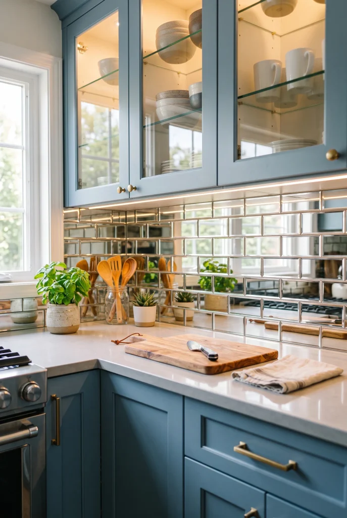
- Bounces natural light throughout the room to instantly double visual depth.
- Creates a subtle reflective surface that makes tight walls feel receded.
- Adds a touch of modern elegance without overpowering existing decor.
- Easy to wipe clean while continuously brightening dark, shadowy prep zones.
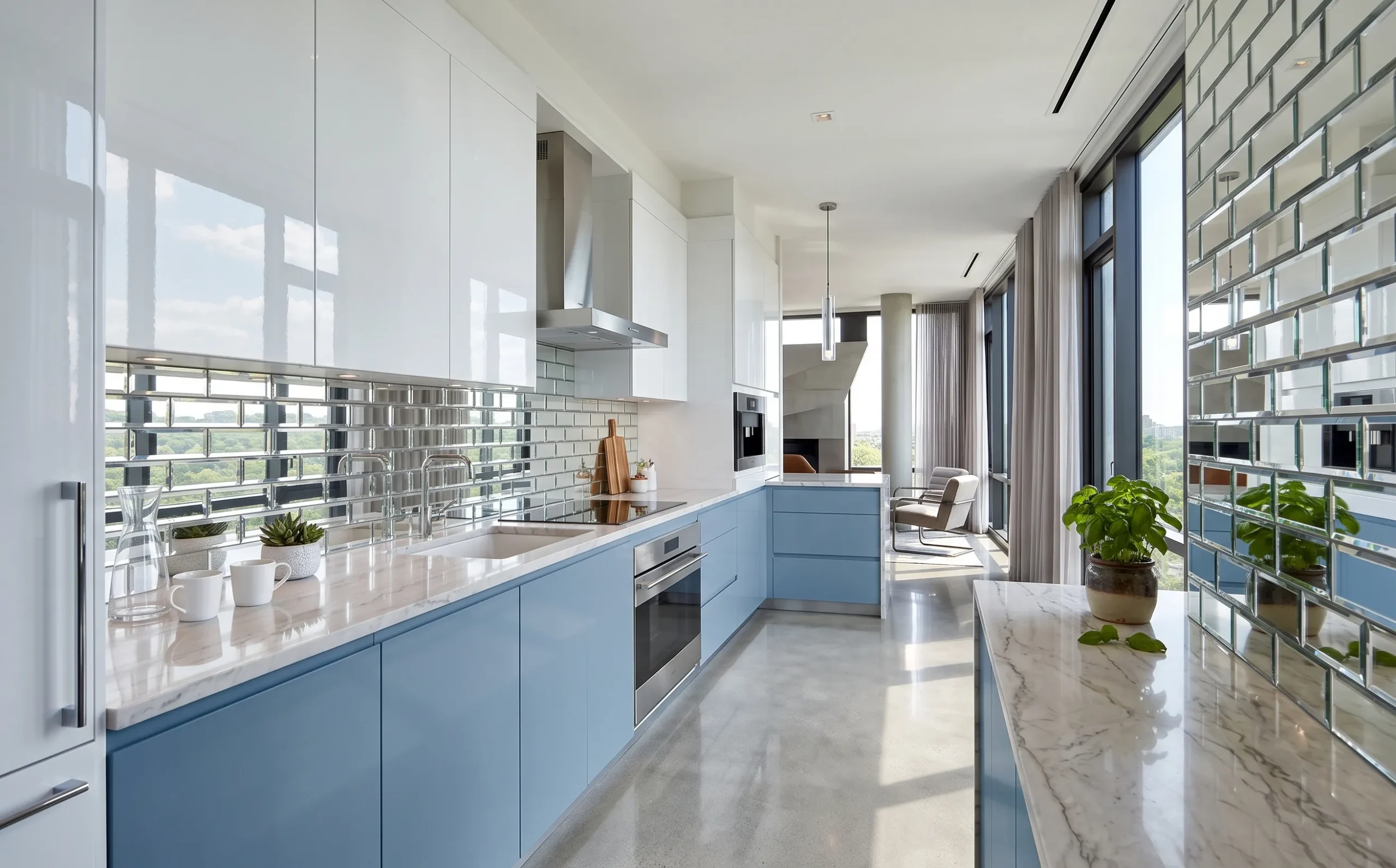
A mirrored backsplash is one of the most effective tricks to trick the eye into seeing more room. By reflecting the opposite wall, windows, and light fixtures, reflective tiles create a convincing illusion of depth that expands your perceived boundaries. In my experience, smoked or antiqued mirror finishes work best because they soften reflections while maintaining that airy, expansive look. Standard tiles simply absorb light, but mirrored surfaces actively multiply it, making even narrow galley layouts feel open and energetic. Sunlight catches the subtle metallic sheen, casting continuous brightness across every working counter throughout the day.
Installing these tiles transforms a standard vertical wall into a dynamic feature that breathes life into tight quarters. The continuous reflection breaks up heavy cabinetry lines, preventing the room from feeling like a cramped box. I’ve noticed that keeping the surrounding color scheme soft—using creams, pale blues, or muted grays—allows the reflective tiles to stand out without clashing. Daily wipe-downs with a basic glass cleaner keep the surface gleaming and clear. When your backsplash acts like an indoor window, your small kitchen ideas turn into a bright, stylish sanctuary that feels twice its actual size.
Integrated Handle Cabinets
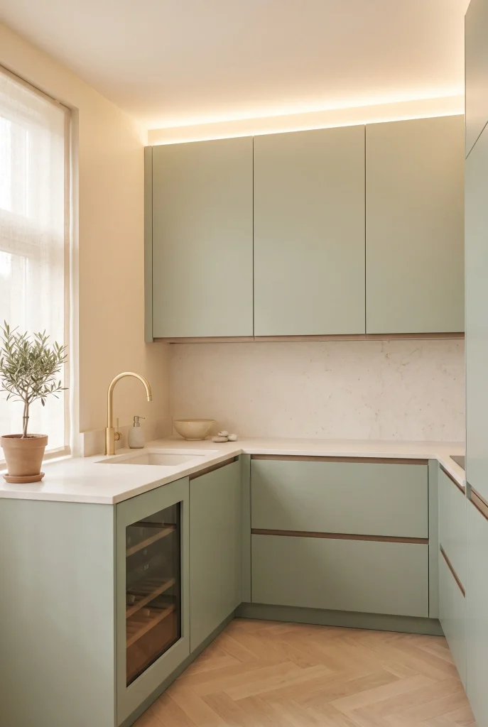
- Eliminates protruding knobs and pulls to create uninterrupted, sleek visual lines.
- Prevents clothes from snagging in narrow, tight cooking pathways.
- Enhances minimalist aesthetic while maximizing physical clearance in walkways.
- Easy to maintain with fewer metal fixtures to polish and dust.
Extruding hardware like bulky knobs and long handles might seem minor, but in tight quarters, they add unnecessary visual noise and physical obstacles. Integrated handles—such as sleek recessed channels or angled J-pull grooves—keep your cabinet fronts entirely smooth and flush. I’ve seen this work exceptionally well in narrow spaces where every inch of clearance counts when moving around. Removing metallic hardware creates continuous, clean lines that allow the eye to glide effortlessly across the cabinetry. This seamless appearance makes wall storage look less like bulky boxes and more like integrated architectural panels.
Beyond the obvious visual benefits, flat-front cabinetry enhances practical movement during busy meal preparation. You will never catch your pockets or apron strings on protruding handles again while navigating narrow aisles. Cleaning becomes remarkably fast and effortless, as you simply wipe across smooth wood or laminate surfaces without scrubbing around tricky metal baseplates. In my experience, pairing handleless fronts with push-to-open latches for upper doors creates an extraordinarily clean finish. This stream-lined, minimalist layout visually declutters your environment, giving you a calm, spacious sanctuary that feels organized, modern, and light.
Cohesive Single-Tone Palette
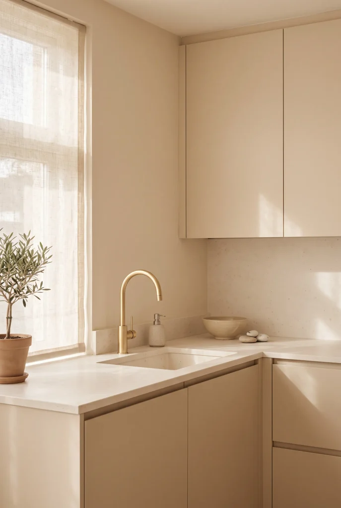
- Erases harsh contrast boundaries to make walls and cabinets blend seamlessly.
- Uses soft, light hues to reflect ambient daylight throughout the entire layout.
- Creates a calm, harmonious atmosphere that feels spacious and unified.
- Allows rich architectural textures and metallic fixtures to shine gently.
Using dramatic contrast between your walls, cabinets, and countertops segments a small layout into smaller, choppy visual sections. Applying a unified, single-tone color palette across all major surfaces eliminates those stark dividing lines, making the entire room feel continuously open. I’ve noticed that painting walls, trim, and cabinetry in matching shades of warm ivory, soft gray, or gentle cream causes structural edges to melt away gracefully. The eye travels smoothly across the unified space without stopping at jarring color transitions. This clever color technique gives tight layouts an instant sense of peaceful expansiveness.
To keep a monochromatic space from feeling flat or sterile, incorporate varied textures rather than bold, clashing colors. Pair matte cabinet finishes with polished quartz countertops, honed stone backsplashes, or soft woven window blinds. That’s why many designers recommend bringing in subtle brass or matte black hardware to add crisp focal points without disrupting the monochromatic harmony. Natural sunlight bounces around light-colored surfaces far more efficiently, illuminating dark corners naturally. Embracing a tailored single-tone design turns a cramped prep area into a tranquil, light-filled hub that feels deliberately designed and remarkably roomy.
Fold-Down Dining Table
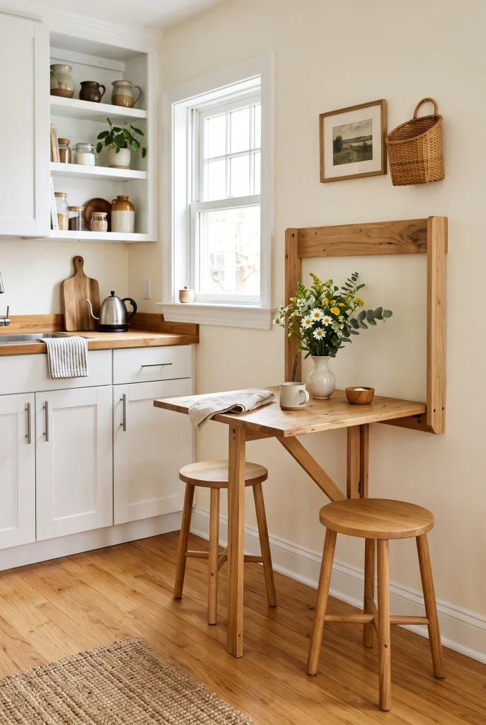
- Converts empty wall space into a temporary eating or prep zone.
- Folds flat against the wall to completely free up floor pathways.
- Eliminates the need for bulky, permanent dining furniture in small spaces.
- Offers versatile functionality for dining, working, or extra chopping space.
A permanent table can quickly dominate a compact footprint, leaving almost no room to move comfortably while cooking. Installing a wall-mounted fold-down table gives you a flexible dining and prep surface that disappears the moment you finish using it. In my experience, these drop-leaf designs offer the perfect solution for tight homes where every square foot must serve double duty. When unfolded, it serves as an inviting spot for morning coffee or casual dinners; when collapsed, your floor space instantly opens back up. This adaptability keeps your traffic paths open and clear.
To maximize this clever setup, pair your wall table with stackable or foldable stools that tuck away into a nearby closet or corner. Choose a tabletop finish that matches your wall color or floating shelves to maintain a smooth visual flow when closed. I’ve seen this work brilliantly as an extended prep counter during heavy meal prep sessions when counter space is at a premium. Keeping your floor clear of fixed furniture legs makes the room feel remarkably larger. This smart, space-saving arrangement delivers total functionality without cluttering your daily home environment.
High-Gloss Cabinet Finishes
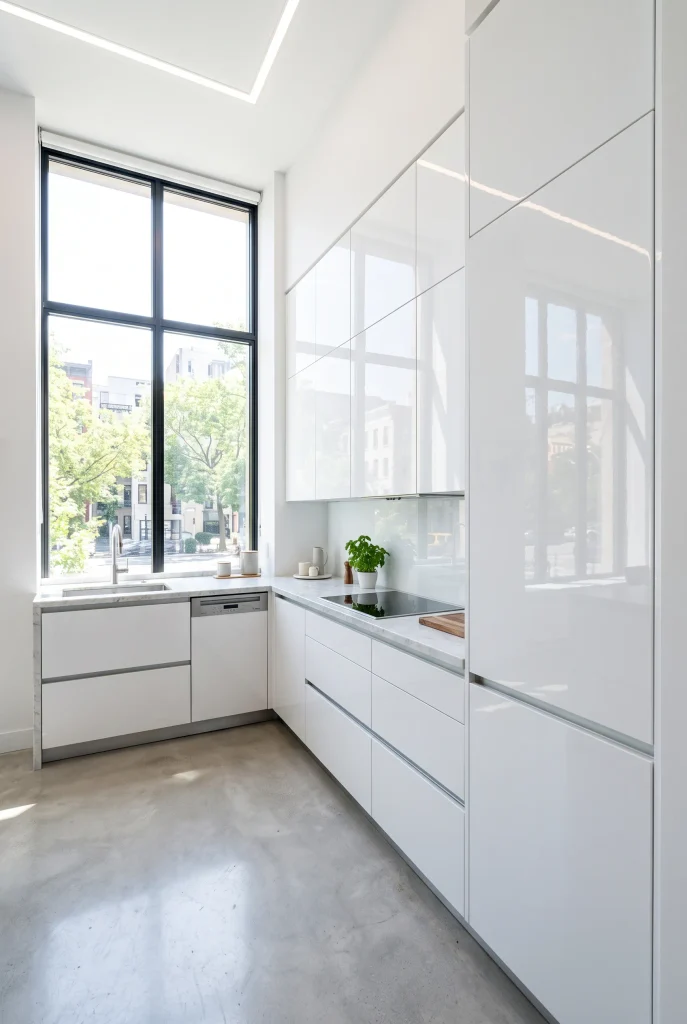
- Bounces natural and artificial light to create deep visual dimensions.
- Reflects surrounding decor, making narrow room boundaries feel expanded.
- Provides a sleek, sleek finish that cleans effortlessly with a cloth.
- Enhances modern aesthetics while brightening dark, shadow-prone cooking zones.
High-gloss cabinet surfaces act like soft mirrors, reflecting light back into the room to alter your perception of space. Rather than absorbing light like matte finishes often do, glossy surfaces multiply every beam of daylight streaming through your windows. I’ve noticed that this constant reflection blurs the physical boundaries of cabinetry, making tight walls feel like they recede outward. Whether you choose polished lacquer, acrylic, or high-gloss thermofoil, the luminous finish instantly brightens dark corners. This continuous play of light gives your cooking environment a fresh, energetic atmosphere that feels spacious and broad.
When adopting high-gloss cabinetry, stick with pale hues like bright white, warm alabaster, or soft ash gray for maximum expansion effect. These light tones paired with reflective surfaces prevent upper cabinets from feeling heavy or overwhelming overhead. That’s why many designers recommend pairing glossy uppers with subtle, low-sheen lower cabinets to balance depth and texture gracefully. A quick wipe with a microfiber cloth keeps fingerprints away, maintaining that brilliant glass-like shine. Incorporating high-gloss elements into your small kitchen ideas turns flat walls into dynamic, light-reflecting panels that enhance spatial depth.
Over-the-Sink Cutting Board

- Transforms unused sink basin area into functional prep workspace instantly.
- Keeps counter clutter minimal by containing prep scraps over the drain.
- Expands usable chopping space without adding physical furniture or islands.
- Stores away easily inside a slim drawer or cabinet when unneeded.
Counter space is usually the first thing sacrificed in compact floor plans, making meal preparation feel frustratingly cramped. An over-the-sink cutting board solves this issue by converting your sink basin into a sturdy, functional workstation. In my experience, custom-fit boards that rest securely on sink ledges instantly give you extra square footage right where you need it most. You gain a dedicated zone for chopping, dicing, and prepping without taking up a single inch of your main countertop surfaces. It is a incredibly simple, low-cost upgrade that dramatically improves workflow.
Using workstation sinks with integrated accessories keeps your cooking area organized, clean, and entirely clutter-free throughout the day. Food scraps drop directly into the sink basin or disposal below, keeping your surrounding counters completely tidy and dry. I’ve seen this work wonders in studio apartments where counter space is limited to just a few feet of total prep area. When finished, simply wash the board and slide it vertically into a narrow cabinet slot. Maximizing every inch of existing fixtures ensures your kitchen remains open, practical, and a pleasure to cook in.
Sliding Pocket Doors
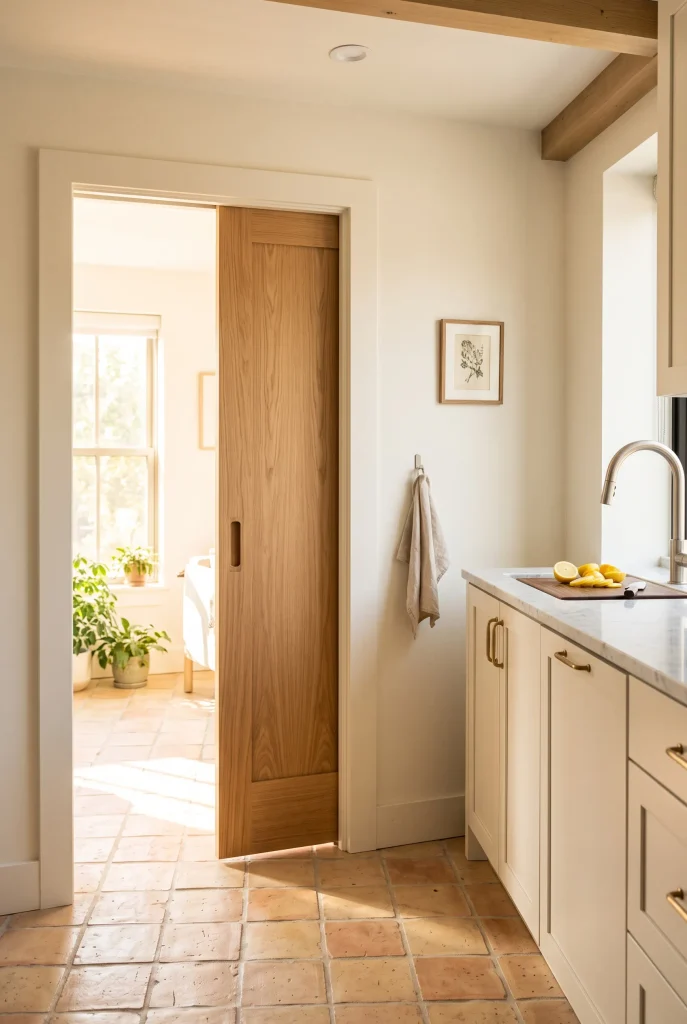
- Eliminates door swing radiuses to free up precious floor clearance.
- Creates a seamless open-concept transition between adjoining living areas.
- Slides completely out of sight into the wall when fully opened.
- Provides instant privacy or mess-hiding capability whenever guests arrive quickly.
Standard swinging doors require a wide clearance arc, taking away valuable wall and floor space in tight home layouts. Replacing a traditional doorway with a sliding pocket door frees up every square inch of that entry clearance. In my experience, this simple architectural change allows you to place tall pantries, butcher blocks, or trash bins right next to the frame. The door glides smoothly into the wall cavity, disappearing completely when open. This opens up sightlines between rooms, letting daylight flow naturally across your floor plan without any physical barriers blocking the path.
This smart door system also gives you total control over privacy and visual clutter during busy cooking routines. When hosting friends or leaving dirty dinner dishes behind, simply slide the door shut to hide the mess effortlessly. I’ve noticed that choosing a door panel with frosted glass inserts allows light to pass through even when closed. This prevents adjoining hallways from feeling dark and closed off while maintaining a quiet, private barrier. Eliminating awkward door swings makes moving through your home smooth, comfortable, and significantly more spacious everyday.
Pendant Task Lighting
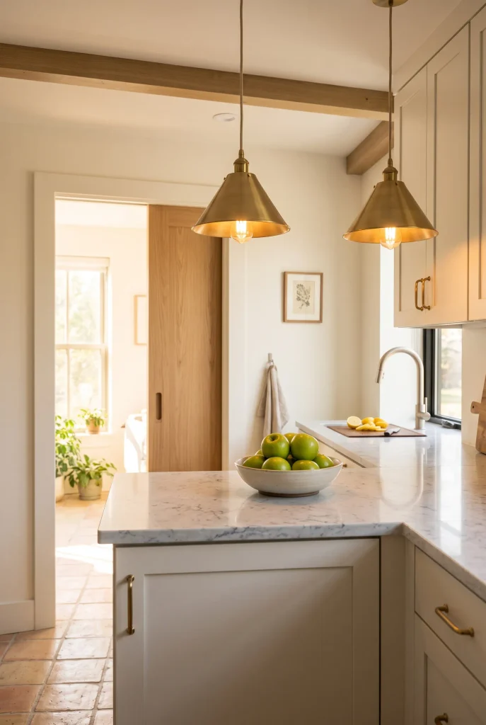
- Draws the eye upward to highlight ceiling height and room verticality.
- Provides focused, glare-free illumination directly over essential prep zones.
- Serves as an elegant decorative focal point without taking up counter space.
- Separates functional cooking zones in open-concept studio apartments effortlessly.
Illumination plays a massive role in how wide, deep, and inviting a compact cooking area feels. Hanging slim pendant lights directly over a peninsula or prep counter draws the eye upward, celebrating vertical height. In my experience, elevating visual focus toward the ceiling makes low or average-height rooms feel taller and airier. Heavy overhead flush mounts often cast harsh, uniform shadows, but targeted pendants create inviting pockets of warm task light. This targeted glow highlights beautiful countertop materials while making the entire room feel thoughtfully styled and open.
Choosing glass, woven rattan, or slim metallic fixtures ensures your hanging lights feel light rather than bulky overhead. Transparent or open-frame pendants allow daylight to pass right through, preserving uninterrupted sightlines across the room during the day. That’s why many designers recommend installing dimmable LED bulbs so you can dial down the brightness for cozy evening ambiance. Layering soft overhead lighting with under-cabinet strips eliminates dim corners completely. Bright, evenly distributed lighting opens up tight boundaries and turns a small kitchen into a grand, welcoming sanctuary.
Open Wire Baskets
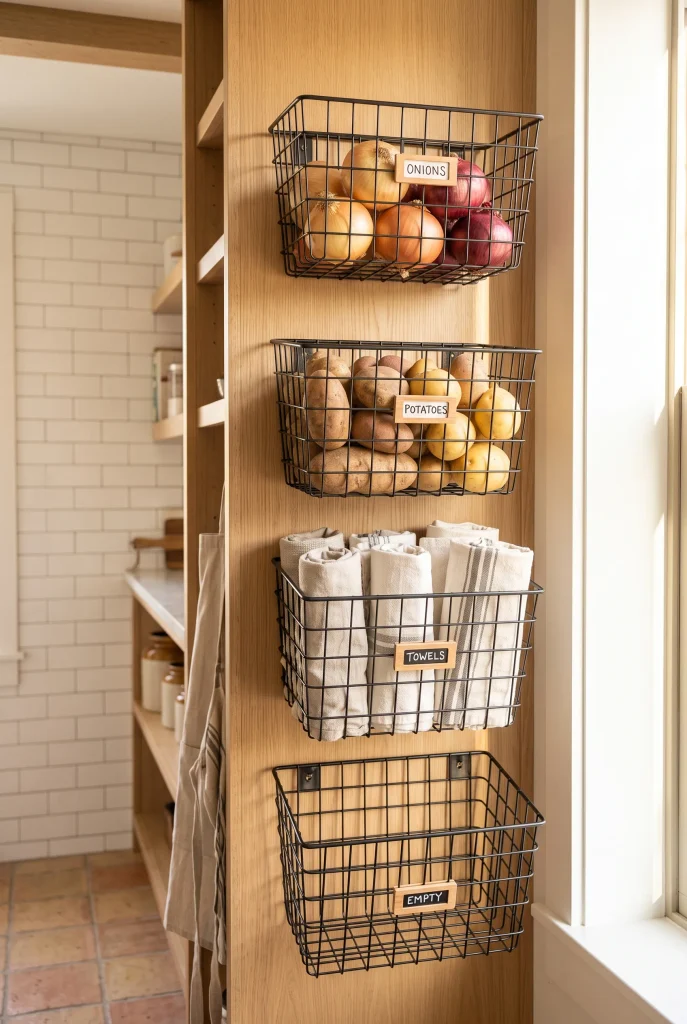
- Keeps fruit, vegetables, and linens visible without using shelf space.
- Allows air movement to keep fresh produce dry, cool, and accessible.
- Adds charming industrial or farmhouse texture to plain blank walls.
- Prevents deep cabinets from becoming cluttered, unorganized dumping grounds.
Deep cabinet drawers often turn into chaotic graveyards for produce, pantry snacks, and clean kitchen linens. Mounting open wire baskets directly onto blank walls or cabinet sides turns unused vertical real estate into breathable storage. I’ve seen this work exceptionally well for fresh garlic, onions, and citrus fruits that require good air circulation to stay fresh longer. Wire grid construction allows you to see everything at a single glance, preventing forgotten groceries from spoiling. It delivers functional storage that feels lightweight, open, and visually interesting.
To maintain a clean look, organize your wire containers by category using simple hanging chalk labels or wooden tags. Group similar items together—like baking essentials in one basket and snacks in another—to make meal prep fast and smooth. I’ve noticed that black or matte brass wire finishes add sharp contrast against neutral walls, creating functional wall art. Because the baskets are see-through, they avoid the visual weight of solid wooden boxes. Keeping daily items off your main prep counters creates a calm, organized space that feels open.
Vertical Stacked Backsplash Tile
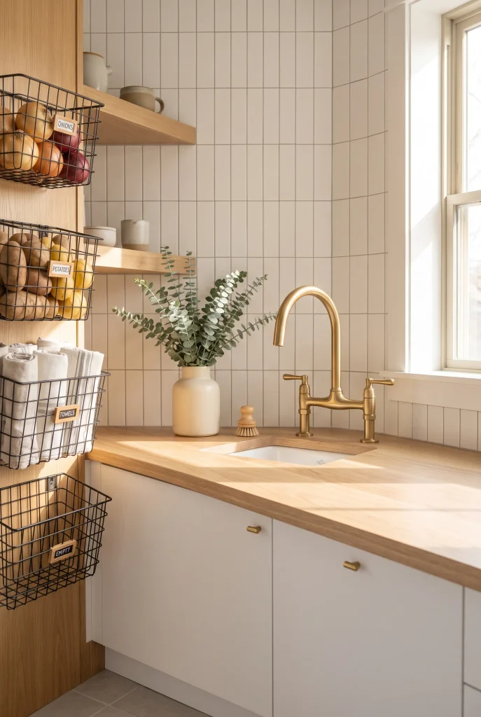
- Draws the eye upward to create the optical illusion of higher ceilings.
- Delivers a sleek, modern update to traditional staggered subway tile patterns.
- Minimizes visual grid chaos by creating continuous, clean vertical lines.
- Reflects soft light along vertical planes to make narrow walls feel taller.
Staggered subway tile patterns can occasionally make narrow walls feel wide and squatty. Laying rectangular tiles in a straight, vertical stack draws the eye directly upward toward the ceiling instead. In my experience, this simple layout shift alters the perceived proportion of a room, making low ceilings feel significantly higher. The unbroken vertical grout lines lead the gaze smoothly from counter to ceiling, creating a clean, architectural backdrop. Sunlight catches the continuous vertical edges, brightening up dark prep zones while adding an airy, elongated feel to your walls.
Choosing vertical tile arrangements works exceptionally well when paired with light, neutral grout shades that match the tile surface. A high-contrast grout can create a grid pattern that feels overly busy in small spaces. I’ve noticed that matte or subtle satin finishes reflect light softly without causing harsh glare, giving the entire cooking area a refined, serene backdrop. Keep your accessories simple to let the vertical tile pattern extend your wall height naturally. Moving the visual focus upward transforms a compact cook space into a loftier, far more expansive environment.
Pull-Out Slim Pantry
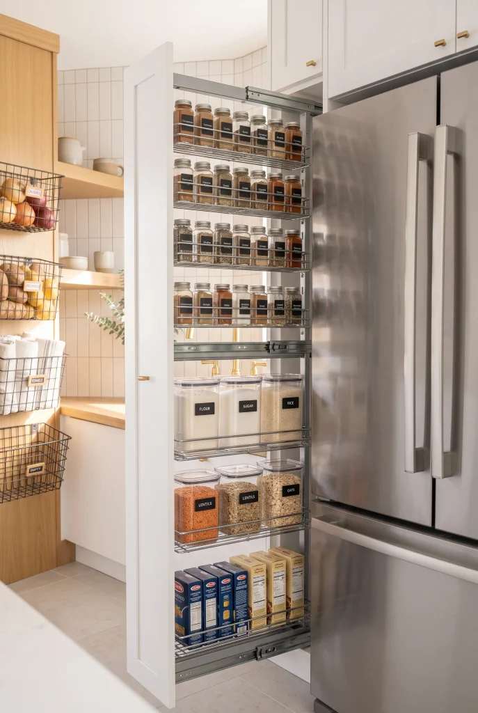
- Reclaims forgotten gaps between appliances and cabinetry for organized storage.
- Slides out effortlessly to reveal every stored item without deep digging.
- Keeps pantry items tucked out of sight to preserve a clutter-free look.
- Maximizes storage capacity while using just a few inches of floor width.
Unused gaps between your refrigerator, walls, or base cabinets often become dead space where dust accumulates. Installing a tall, pull-out slim pantry rack turns a tiny three-to-six-inch gap into an extraordinarily functional storage hub. In my experience, these narrow vertical drawers are ideal for organizing oils, spices, canned goods, and baking supplies in a single, accessible location. Instead of reaching deep into dark, crowded cabinet shelves, you simply roll the entire rack outward into full view. Everything stays organized, visible, and within quick reach while cooking.
This hidden storage solution keeps essential cooking ingredients completely off your main prep counters, instantly opening up valuable workspace. The vertical multi-tier design utilizes full wall height while occupying zero clearance in your central walkways. I’ve seen this work wonders in tight apartment kitchens where standard pantry closets simply do not fit into the floor plan. The seamless front panel slides back flush with your existing cabinets when closed, preserving clean visual lines. Reclaiming dead space with smart, concealed storage makes your kitchen feel larger, neater, and remarkably efficient.
Floating Kitchen Island
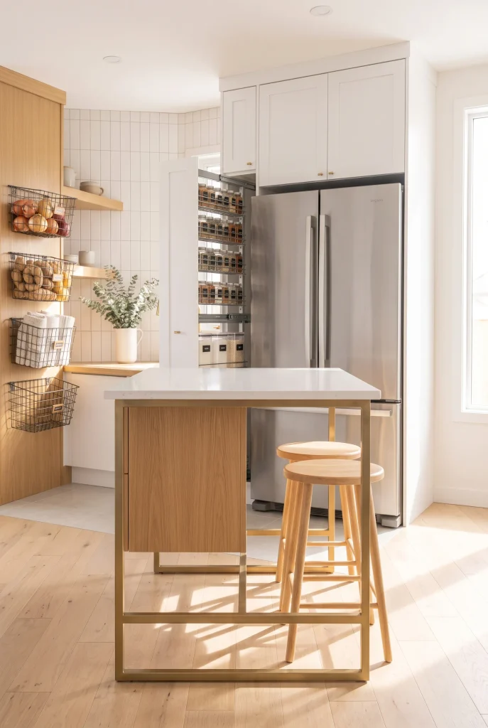
- Features an open-base frame that allows light and flooring to pass through.
- Provides essential extra prep surface and seating without blocking sightlines.
- Creates a mobile or visually light anchor for compact, open floor plans.
- Tuck-in seating options eliminate floor clutter when the island is idle.
Traditional kitchen islands with heavy, solid cabinet bases can easily overwhelm a compact room, blocking light and floor space. Opting for a floating-style island with an open frame or leg structure preserves open sightlines underneath the tabletop. In my experience, seeing the floor extend beneath the island instantly Tricks the mind into perceiving more total space. You gain a versatile prep counter and breakfast bar without creating a heavy visual obstruction in the center of the room. Sunlight flows freely under the table frame, keeping the overall atmosphere airy and open.
To keep this central piece functional yet lightweight, choose an island design that includes thin metallic legs, light wood, or integrated overhangs. Tuck slim, backless stools completely underneath the counter when they are not in use, freeing up primary walkway paths. That’s why many designers recommend mobile floating islands on lockable casters, allowing you to roll the table against a wall whenever extra standing room is needed. A lightweight, flexible island adds invaluable counter space while maintaining an open, breezy floor layout.
Neutral Floating Countertops
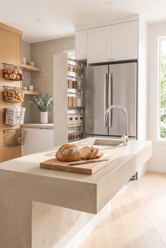
- Eliminates heavy lower base cabinets to reveal expansive floor area.
- Reflects natural light across smooth, uninterrupted neutral stone surfaces.
- Creates a weightless, architectural floating effect that feels modern.
- Provides full accessibility while keeping foot pathways completely clear.
Removing bulky base cabinetry in favor of wall-mounted floating countertops instantly alters how spacious a tight floor plan feels. When your flooring extends all the way to the back wall without obstruction, the room feels broader and far more open. In my experience, using neutral tones like warm limestone, soft concrete, or creamy quartz creates a seamless transition that blends with surrounding walls. The weightless design allows light to circulate freely beneath the workspace, banishing dark floor shadows. You gain a fully functional prep zone that feels open, airy, and uncluttered.
Integrating floating surfaces requires thoughtful organization beneath to prevent loose items from cluttering the open floor below. Place a few woven linen baskets or a slim wooden crate neatly under the counter to hold essential cleaning supplies out of direct view. I’ve noticed that pairing light-toned stone surfaces with understated wall-mounted faucets accentuates clean architectural lines. This minimalist approach eliminates unnecessary visual clutter, letting daylight bounce off smooth surfaces effortlessly. Streamlining your prep counters transforms a cramped cooking corner into an expansive, peaceful environment designed for effortless movement.
Recessed Wall Noches
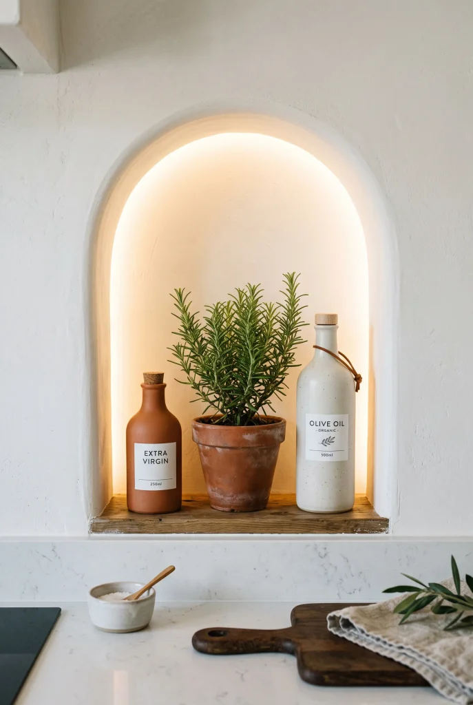
- Carves storage directly into wall cavities to save precious counter space.
- Serves as an elegant, built-in display for daily cooking essentials.
- Maintains a flush, smooth wall profile without protruding shelves.
- Adds architectural depth and warmth when paired with soft interior lighting.
Protruding shelves and hanging racks can sometimes feel intrusive in extremely narrow cooking spaces. Carving recessed niches directly into stud walls utilizes hollow vertical space without extending an inch into your walking path. In my experience, placing a custom niche behind the stove or sink creates an ideal spot for olive oils, spices, and cooking utensils. The storage stays completely flush with your dry wall, preserving clean, flat surfaces. It provides functional organization while keeping your main countertops completely empty and ready for active meal preparation.
To make wall niches stand out as a intentional feature, paint the interior alcove a subtle shade warmer than your main walls or line it with slender mosaic tiles. Adding a concealed LED strip at the top of the niche casts a warm, soft glow down over your displayed items during evening hours. I’ve seen this work wonderfully to turn basic cooking ingredients into an artful, organized display. Eliminating outer wall protrusions keeps your sightlines clear and open. Built-in wall niches prove that smart, integrated storage can elevate both functionality and spatial openness simultaneously.
Compact Ceiling-Height Cabinets
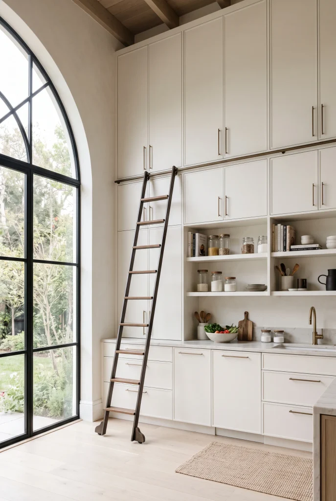
- Extends vertical storage to the ceiling to eliminate dust-collecting upper gaps.
- Draws the gaze upward, making average room heights feel significantly taller.
- Conceals seasonal kitchen tools and lesser-used appliances completely out of sight.
- Delivers a sleek, custom built-in appearance that streamlines the room.
Standard upper cabinets often leave a twelve-inch gap beneath the ceiling, creating an awkward empty space that collects dust and visually shortens walls. Extending custom cabinetry all the way to the ceiling line eliminates that awkward gap while maximizing every inch of vertical storage. In my experience, continuous cabinetry draws the eye upward, giving the illusion of soaring ceiling height. Stashing seasonal items, extra paper goods, and specialty appliances in the highest cupboards keeps your daily-use lower shelves uncluttered and organized. Your entire room benefits from a custom, built-in aesthetic.
To prevent tall, full-height cabinets from overwhelming a compact space, choose flat panel doors finished in soft, light colors that match your wall paint. Using push-latch doors on the top tier keeps the upper profile smooth, handle-free, and visually weightless. That’s why many designers recommend using paneling that mirrors surrounding trim to create a cohesive architectural wall. Natural light bounces off the continuous cabinet fronts smoothly, keeping the room looking uniform and expansive. Vertical full-height storage turns overlooked overhead space into a functional asset that enhances overall room proportions.
Reflective Glass Subway Tile
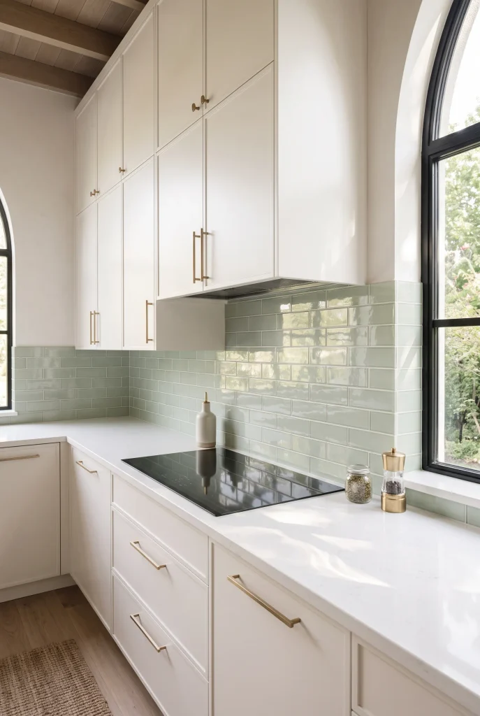
- Bounces incoming daylight deeply into dark, shadowy cooking corners.
- Adds subtle color depth and gloss without heavy visual weight.
- Smooth non-porous glass surface cleans effortlessly after cooking sessions.
- Enhances spatial illusion through continuous light reflection across walls.
Glass tiles act as natural light amplifiers, catching every stray beam of sunlight and dispersing it softly around your prep environment. Unlike traditional ceramic options that absorb ambient light, translucent glass surfaces reflect it backward, making perimeter walls appear further away than they truly are. In my experience, installing light-tinted glass tiles—like soft seafoam, subtle glacier blue, or ice white—adds refreshing color while maintaining a airy, weightless feel. The continuous sheen creates dynamic depth across your backsplash, turning a basic functional wall into a glowing backdrop.
To maximize this luminous effect, pair reflective glass tiles with white or light gray grout lines that blend smoothly into the tile field. Avoid high-contrast grout, which cuts the wall into a dense, busy grid that can feel claustrophobic. I’ve noticed that under-cabinet task lighting works exceptionally well with glass tiles, casting a brilliant glow that brightens your workspace during nighttime prep. The smooth, non-porous surface wiped down easily, staying sparkling clean with minimal effort. Introducing translucent glass materials transforms compact walls into radiant, open surfaces that elevate your entire kitchen layout.
Integrated Concealed Appliances

- Hides bulky metallic appliances behind matching custom cabinet doors.
- Creates an uninterrupted visual flow that makes small rooms look uniform.
- Reduces visual clutter and fragmented appliance lines significantly.
- Delivers a high-end, tailored aesthetic that feels quiet and spacious.
Exposed stainless steel or black appliances often segment a compact kitchen into visually noisy, disjointed blocks. Panel-ready appliances allow you to cover your dishwasher, refrigerator, and trash drawer with cabinet fronts that match your surrounding woodwork. In my experience, blending heavy appliances seamlessly into your cabinetry keeps the eye moving smoothly across walls without stopping at dark metallic breaks. This continuous surface design trick makes a compact cooking space feel like a unified living area rather than a crowded equipment zone, creating a calm, expansive atmosphere throughout.
Maintaining a unbroken line of cabinetry alters how you perceive the actual size and depth of the room. When major appliances disappear behind sleek wood or painted panels, the whole kitchen feels noticeably airier, cleaner, and less chaotic. That’s why many designers recommend paneling the largest appliances first to eliminate dominant visual distractions instantly. The clean, integrated panels reflect ambient light uniformly across your layout. Streamlining appliance surfaces delivers a sophisticated, uncluttered look that opens up small room layouts while maintaining complete modern functionality.
Overhead Ceiling Pot Rack
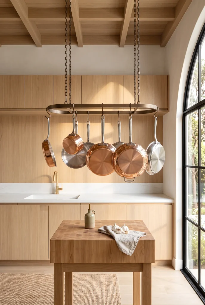
- Utilizes unused vertical ceiling space to free up deep cabinet storage.
- Keeps heavy pots and pans easily accessible during daily meal prep.
- Draws visual focus upward to highlight overhead ceiling height effectively.
- Frees up lower drawers for bulky pantry items and small appliances.
Bulky pots and pans take up massive amounts of precious cabinet space, often forcing lower drawers into cluttered, tangled chaos. Hanging a slim, stylish pot rack from your ceiling reclaims that lost storage potential while freeing up deep base cabinets. In my experience, suspending cookware overhead draws the eye upward, emphasizing vertical room height rather than narrow floor space. When placed strategically over a kitchen island or unused corner, a pot rack keeps essential cookware right at your fingertips while turning functional items into decorative art.
To ensure an overhead rack enhances roominess without feeling heavy, choose a minimalist frame crafted from slim metallic bars or brushed brass wire. Keep the arrangement organized by hanging only your most frequently used, attractive cookware rather than overcrowding the grid. I’ve seen this work brilliantly in narrow galley layouts where lower cabinet drawers are severely limited. Sunlight filters through the hanging copper or stainless pans, casting soft reflections across the room. Utilizing vertical ceiling height keeps your prep counters clear and your lower cabinets completely organized and spacious.
Conclusion
Transforming a tight cooking area into a bright, airy sanctuary is entirely within your reach. By applying a few of these practical small kitchen ideas, you can eliminate daily clutter, maximize your vertical space, and make your home feel significantly larger without knocking down walls. I’ve seen how small changes like these can completely transform a space, turning everyday meal prep into a joyful, effortless routine. Choose one or two of your favorite design tips to try out in your home today. Be sure to save this post on Pinterest for future inspiration and share it with friends planning their own home refresh!